Report
Below is a web copy of our more detailed report on the findings. A document version can be found here.
Table of Contents ∙ Abstract ∙ Rationale ∙ Participants and Recruitment ∙ Data Collection ∙ Data Analysis Methods ∙ Analysis ∙ Conclusion
Abstract
The goal of this study is to discover how people put up posters in a situation with limited available space. To accomplish this, we gave participants posters of various content to put on a board in two different scenarios to see how they use up the space available to them. Observing their behavior let us explore what different spaces, poster content, and other properties people prioritized when forced to work with a finite area.
Rationale
At a school like NJIT where thousands of students are crammed into a space of only a few city blocks, understanding how the student body takes up space with advertising will only be vital as the years go on. Without any development towards new infrastructure, maximizing current available space and understanding how current students perceive taking up space will help any event or program enhance their current engagement with the university student body.
Participants and Participant Recruitment
We recruited participants by asking our friends to ensure that we had a variety of viewpoints represented. We had four participants in this study, all sophomores of varying involvement on campus. As established in their opening interviews, they ranged from very active, to active in specific clubs they are dedicated to, to not active at all. This was to see if those who were familiar with the content on the posters would bias themselves in any way.
Data Collection
We start the participant with a short starting interview, asking about their activity on campus and how often they use bulletin boards or other communal spaces on campus. After this, the board is presented.
The board had four posters already placed on it, two towards the corners and two near the center. Intentionally, the board is too small to fit all the posters, comfortably fitting only about 15. The remaining posters were divided into two stacks based on the order they would be handed to the participant: a larger stack of 14 for the first scenario, and a smaller stack of 5 for the second scenario, all of various contents. These numbers were chosen intentionally, so that the board was barely overfilled at the end of the first scenario.
After the opening interview, the participant is handed the stack of 14 posters and told to arrange the posters any way they see fit on the board. They can move any poster of those 14 around, but cannot move any pre-placed posters. Participants were told that they can ask questions and to vocalize their thought process, and that they had around 10 minutes to complete the task. No further instruction was given other than 5 minute and 1 minute warnings, unless the participant asked a question.
After placing the first 14 posters, the participant is presented with 5 more posters, and told to place them as well. However, there is the caveat that posters from the previous scenario are now treated as immovable. The same instructions were given, with a 5 minute time limit.
Finally, we interviewed the participant with the closing interview. They were asked questions on what posters they covered up, what their thought process was, what content they valued on a poster, and how they prioritized the use of space. We also asked them more specific questions on the behaviors observed as they placed the posters.
Data Analysis Methods
Coding Cycle #1: In-Vivo Coding
To start effectively synthesizing the code for such an interesting collection of data, we utilized the in-vivo coding process with the transcripts of the start and ending interviews conducted for each participant. By utilizing the exact text to develop code, we believed it would create a better, more objective end result without the filter of generalization from the lens of either of us. We marked areas that were similar, such as participants talking about a specific poster, and any notable aspects of their responses to our structured interview questions. While in hindsight we understand that semi-structured interviews probably give the best form of leeway so that the code is not already in pre-existing 'sorted' categories prior to sorting, we believe that our structured interviews (with unplanned follow up questions) provided the best of both worlds. It allowed us to get the data we were looking for and (as a bonus) additional tidbits of information.
Coding Cycle #2: Affinity Mapping (Attempt 1)
Every piece of code was written onto a sticky note and then put onto the center of the table. There was a lot less data this time around due to wanting to streamline the process, but you'll see that this was redone again in our second iteration. We came up with about 5-6 small categories, which can be best summarized as having four major elements:
- Density and where their eye goes,
- Content,
- Their priorities (academia vs "character"), and
- Their ability to empathize
- Better defined as “their interpretation of putting themselves in the shoes of someone putting up the poster
Coding Cycle #3: In-Vivo Coding (again)
We cleared the board and started from scratch, painstakingly taking the time to go through each interview transcript again, and also looking at the recordings to better understand the emphasis of anything that was said. Sometimes you realize the way that a participant said something might be more important than what the words themselves are, because it gives away a lot of information that can't be really put into words. The intonation and inflection of certain words, the hand gestures, the glances / pointing at the posters - those small significant details allowed us to pick and choose code that we believed were actually of value.
Coding Cycle #4: Affinity Mapping (Attempt 2)
This was the one!! This goliath of a map (the image is also in the shared Google Drive folder) is something that we believe describes our best efforts in synthesizing this enormous swath of data. We noticed that there were some similarities between the first and second attempts, but this was more detailed.
Analysis
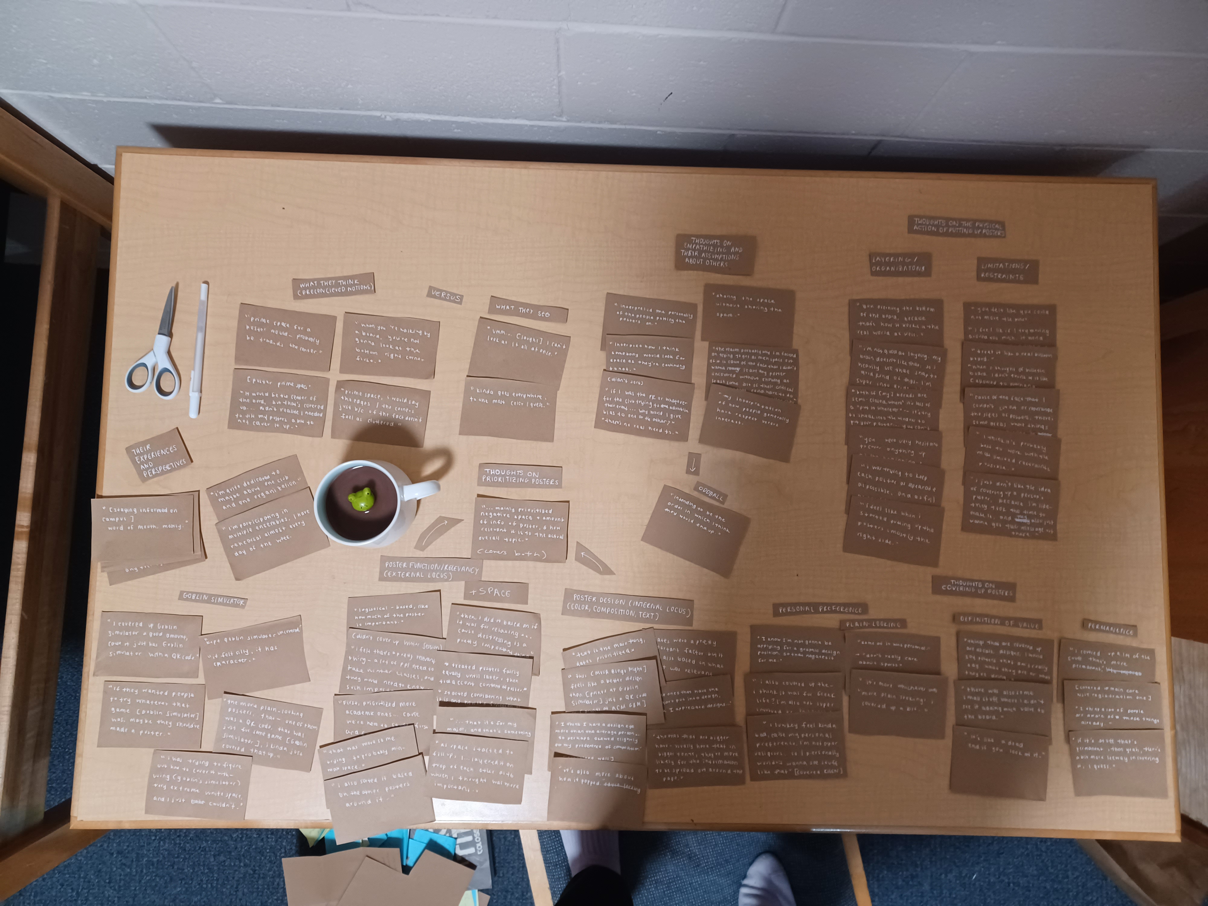
The final map is organized as follows:
- Thoughts on prioritizing posters
- Poster function/relevancy (external locus of control)
- This meant that the ultimate deciding factor of prioritization was outside the control of the poster by some other form of ruling (i.e min-maxing space/academia/relaxation/its relevance to the student body/the participant's definition of “importance”)
- Poster design (internal locus of control)
- This meant that the ultimate deciding factor of prioritization was due to something the poster could 'control' (i.e how it looked/design/composition/colors/text)
- Thoughts on covering up posters (or how a participant deigned something 'unimportant')
- Personal preference (i.e. how interested they are in it/plain-looking vs. artistic)
- Definition of value (i.e. a participant's belief in usefulness)
- Permanence (defined as if the event itself is long-term or short-lasting)
- Thoughts on the physical action of putting up posters
- Layering/organization (how participants physically structured the posters)
- Limitations/restraints (what participants thought they could/could not do)
- What they think versus what they see
- What they think (preconceived notions)
- What they see (final results)
- Thoughts about empathizing and their assumptions about others
- Oddball - “intending to be the order in which I think they would end up”
- Their experiences and perspectives (a participant's background/involvement)
- Goblin simulator (this was the name of a poster that every participant brought up)
Some extra observations:
All participants attempted to leave as many posters on the board visible as possible initially. Some of them kept the effort up throughout both scenarios, only partially obscuring posters, while others gave up eventually and decided to cover up posters entirely.
A common thread between all of the participants was the de-prioritization of “white space” on posters. The more “plain” a poster looked, or the more inefficiently a poster used its available space, the more likely it was to be covered. Where participants differed was judging what information was valuable when either partially or fully covering up a poster. All participants preferred to leave text containing date or location uncovered as the most important information on a poster. From there, it varied. A participant judged titles as unimportant, while another said that logos and images were not.
Another factor in covering up posters was the “permanence” the poster was being judged on. If the poster wasn't urgent, such as an event happening in a week or a call to action, it was more likely to be covered up. Posters without a date, or having relevance for several weeks or months were usually judged to be permanent. The reasoning for this that several participants gave was that permanent content was more likely to be seen before already, so more novel posters could cover it up temporarily.
The biggest reason for posters to be covered up was the participant's own personal preference in content. When personal preference was cited as a reason, the poster was more likely to be almost completely covered up. Preferences were both aesthetic and content related. Some of the posters were judged as having suspicious content, and were covered up for that reason. A participant did not like religious content, and another was not interested in athletics or Greek life. One prioritized academic content, while another promoted “relaxing” events.
 A big reason that people did not want to cover up posters was because they empathized or respected other people's space. When using communal space, there is the unspoken rule of not interfering with other people's content, as they wouldn't want someone else to mess with their own. As one participant pointed out, it was “sharing the space without sharing the space”.
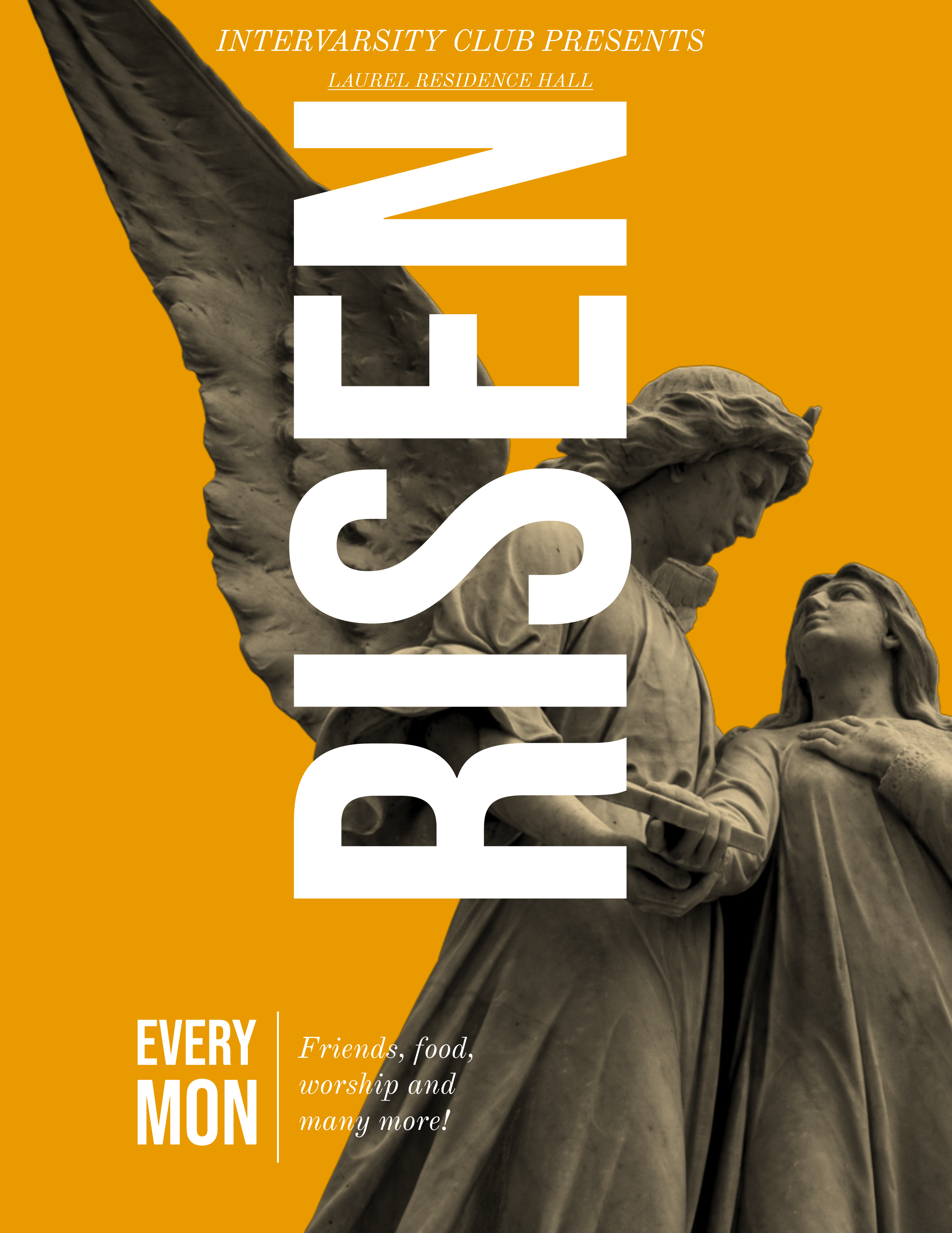
One of the most covered posters was “Risen”, the poster for the religious club. Because of the very nondescript design and time agnostic content combined with the personal beliefs of the participants, it tended to be covered up. Because of the assumptions that the event happened weekly and people who were practicing likely already knew about the events, it was viewed as less important for people to know.
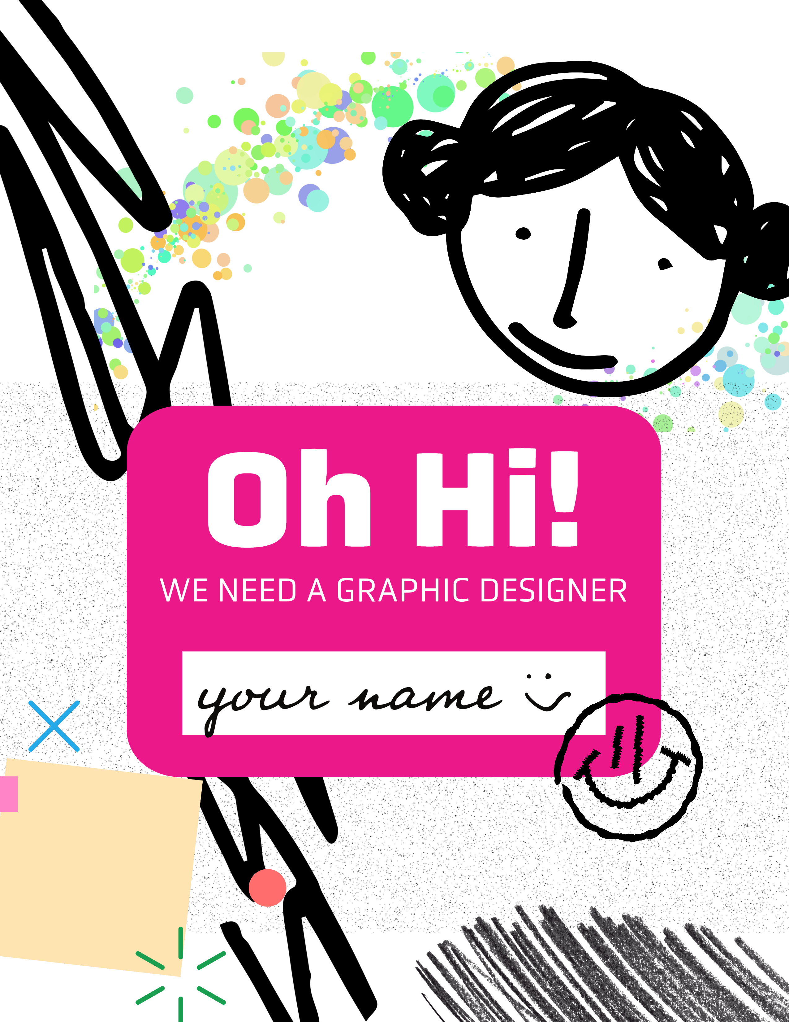 Another poster that was covered a lot was the “Looking for Designer” poster. Reasons cited included the lack of contact information, very amateur / template design, and the lack of urgency presented on it. Participants felt as though the poster did not have any valuable or relevant information, and was generic and uninspiring, so it was one of the first to be covered.
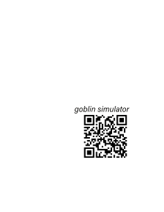 “Goblin Simulator” was a poster that every participant mentioned during the concluding interview. It was either brought up to be an example of extreme white space and therefore “easy” to cover up, or left open because of its “silliness” and “character”. Participants were either confused on how to balance it or covered it with ease. This poster was intentionally designed to be very blank and empty, reminiscent of similar posters found around campus. This 'empty space' was key in understanding a participant's underlying priorities: did they care about the design of the poster (something the poster itself could ‘control’) or did they care about the poster in terms of some other mental classification (like maximizing space, or organizing by some definition of 'functionality')? Thus, while “Goblin Simulator” paid homage to its ancestors as a jokingly-developed recreation, it also gave further insight into how participants developed their own classifications of shared spaces and how posters belonged within it.
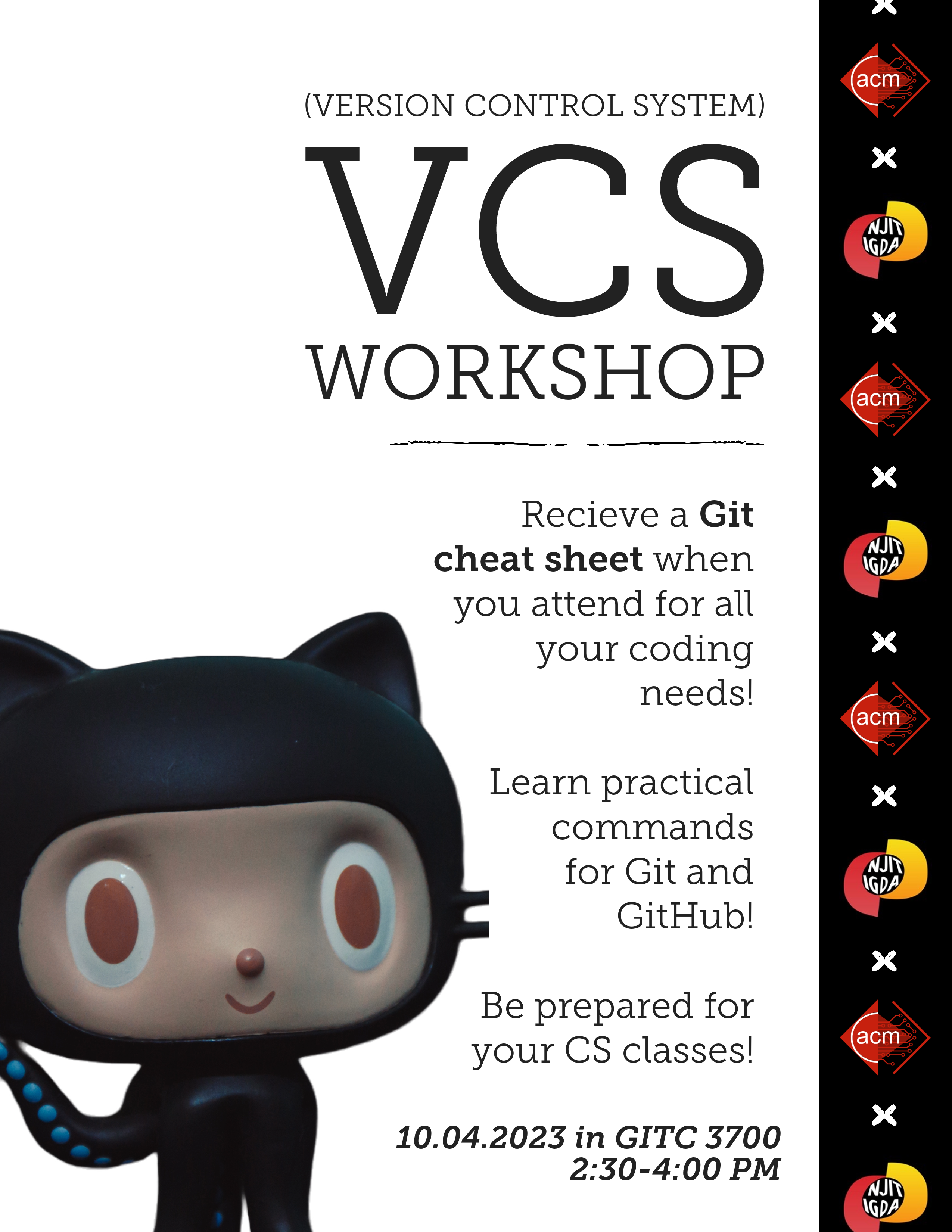 The poster that was shuffled around the most was the “VCS Workshop” poster. The layout is very unique, with a focus on verticality over the traditional left to right pattern that follows the way people read English. Because most of the important information is focused in a central column with white space and a mascot to the left and logos to the right, it broke many people's organizational systems. Every participant covered a different part of the poster while leaving it mostly visible due to the weird placement of its white space.
Conclusion
Overall, our study showed that shared spaces allow for a diverse set of thinking and actions to emerge. The way that each participant approached the scenario differently sheds light on why bulletin boards are arranged the way they are around campus. They’re messy, disorganized, and show zero sense of cohesion, until you come to realize that each person putting up a poster viewed the exact same bulletin board from a different perspective and categorized it differently so that, in their eyes, their poster was right where it belonged.